Website Desgin
At the beginning of creating our website, we decided to implement a website that focuses on
delivering healthy lifestyle resources to motivate and educate visitors. Red, black, and white were the main
colors of the website. The choice of colors for the fitness website design is intentional to reflect the
essence of the fitness and health theme. Red represents energy and excitement. White is chosen for its
simplicity, clarity, and balance. Black adds a sense of elegance and strength to the design. The combination
of red, white, and black provides contrast which improves the readability of the text and the visibility of
essential elements of the website. Visitors will be excited to re-visit the website due to its valuable resources,
they will be excited to try out new nutritious meal ideas and delicious recipes to prepare. In addition, they’ll be
tempted to come back to the training packs, which provide a range of exercise videos customized to meet their fitness
objectives. Visitors will also find the website a reliable tool whenever they need to count their estimated calories needed per day.
The structure of the pages was built via HTML, CSS, and JavaScript. HTML contains the fundamental components
to organize and present the content. For instance, each page has its own sections presented using div tags
to enhance the visitor experience by making it easier to navigate and understand the information presented
on the page. Along with classes and IDs that are used to uniquely identify or classify elements on a web
page which helps easily apply styles using CSS. CSS plays a significant role in controlling the layout of
pages. All styles applied using CSS were chosen carefully targeting the attraction of the visitors.
JavaScript plays a crucial role in making web pages interactive, enhancing the overall visitor experience
with smooth animations and visual effects. To maximize the developer's maintainability for future upgrades,
HTML, CSS, and JavaScript file were separated from each other, sections were presented by
divs with consistant namings for each class and ID making code modification easier.This approach
contributes to the accessibility and adaptability of our website.
Home page
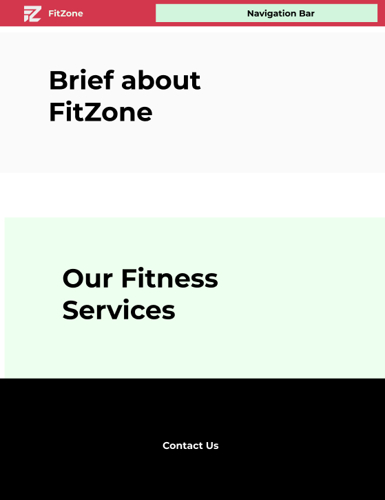
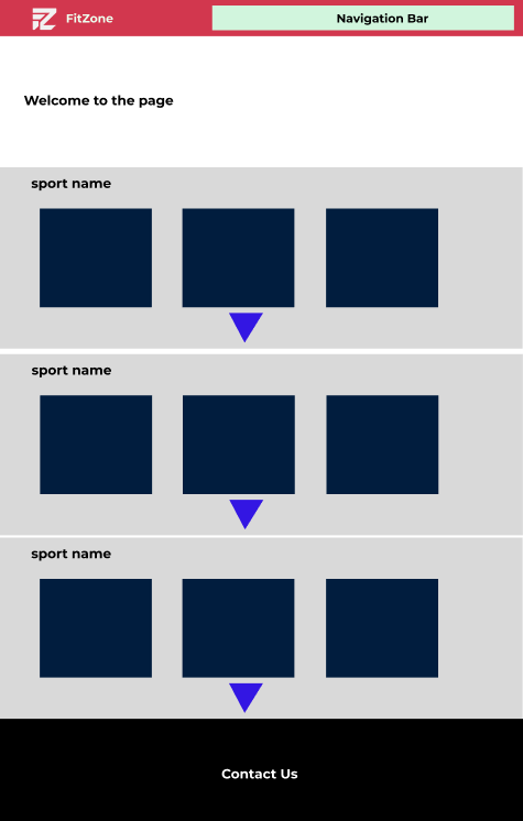
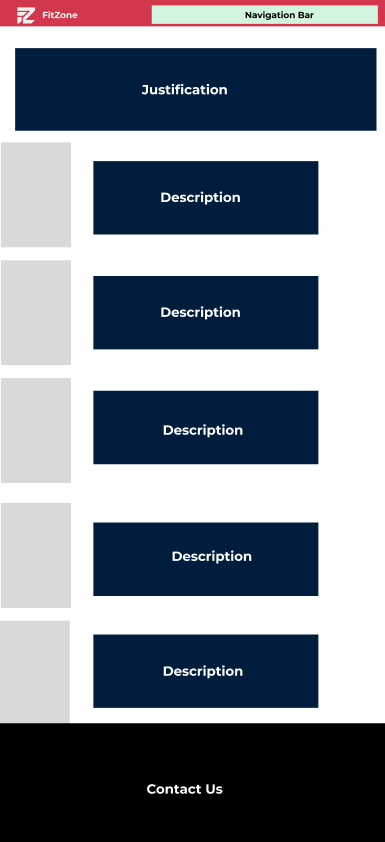
The design of the home page stands as a key factor, as it is the primary determinant for visitors to continue browsing and exploring or not. The header was designed to allow visitors to navigate between the website pages easily. It provides a visual response when visitors interact with the link elements using CSS, for instance, by highlighting the links when the visitor hovers. The same goes with the footer along with the necessary information to contact or inquire. The main content of the website presented a brief on the website, followed by the services we offer to visitors such as training videos, a calorie calculator, and delicious recipes. At the end of the content, a register form is implemented by JavaScript where instant feedback is given to visitors while submitting the form to help them make quick corrections if needed. To move between the home page sections a scroll button is designed to make the scrolling experience more dynamic as the visitor prefers.
First sub-topic
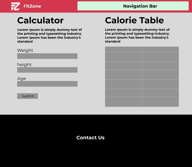
The first sub-page contains a calorie calculator, which is a very handy tool that allows the visitor to
input his weight, height, and age and click the calculate button to get the calories he needs per day.
The calculator aims to target visitors' attention and encourage them to spend more time on the site. In
addition, visitors can return to the site to use the calculator repeatedly, increasing overall
engagement. Besides on the right, a table is presented to illustrate the calorie count for a range of
commonly consumed foods.
Third sub-topic
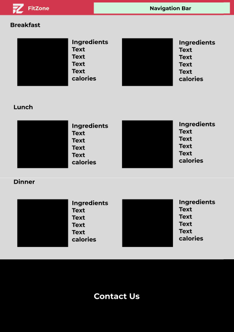
Our third sub-page is Recipes which has multiple options of healthy recipes for breakfast, lunch, and
dinner meals. Along with its nutrition facts and the ingredients needed to cook any meal that the
visitor prefers. A card was designed to illustrate the content. On the left side, the dish image is
presented, on the right side, we have the dish name, and below it, the nutrition facts are presented
with a markable color. The second part of the right side contains the ingredients and the instructions
for the recipe. The cards are designed to fit as many as they can within the page to ensure a
visitor-friendly experience. When the visitor hovers over the card an outline appears.
